Research on kinetic experimental typography:
Reversed Mirror - Eduardo Kac
Tiger Dust - Kevin Blanc
Flickermood 2.0 - Sebastian Lange
Viva Zombatista - Kristian P
HBO Open Doors - MK12
Beauty in Danger - MK12
Sleeping Beauty - MK12
Poemfield No. 2 - Stan VanDerBeek
Saturday, 17 January 2015

Thursday, 30 January 2014
Manchester Met Portfolio - Post 10


I have used collage, ink and stick, ink
wash and coloured
paste to create these two pieces of experimental drawing. Having previously made a 3D
paper sculpture of my initial object, an oil can, this drawing came from
looking at the sculpture.
841 x 594 mm
841 x 594 mm
Manchester Met Portfolio - Post 9


Looking at a candle holder, I used a variety of media to produce these pieces such as collage, tape, ink, wash, pastel and felt tip. I also used a variety of drawing techniques including blind drawing and continuous line drawing to create different effects. I found it beneficial to work on multiple pieces at a time because as I returned to each piece, I found different sections I could alter and improve to make the piece look more like my object.
Top 2 pieces - 594 x 420 mm
Bottom 3 pieces - 420 x 297 mm


Manchester Met Portfolio - Post 7


These are a few more examples of
sketchbook pages from when I was in the 3D design section of my Foundation
course. I particularly enjoyed experimenting and making the smaller samples to
see what was successful before making the larger pieces. Having time to
experiment with the different materials really made me explore their potential
and see the different shapes they could each create.
297 x 210 mm
Manchester Met Portfolio - Post 6


These are a couple of examples of pages from my sketchbooks. I like working in sketchbooks as I find it beneficial having all my work in one place which I can look through. Also, adding notation on what I think has worked successfully or not helps me define my own thoughts and makes it clearer for myself what I like and want to carry on experimenting with.
297 x 210 mm
Manchester Met Portfolio - Post 5

After creating the previous piece on
paper, I printed it onto acetate to allow me to use it for photograms in the
darkroom. By blocking sections of light with my hands I created the background
pattern. I particularly like the range of shades made by covering different
areas of the paper for different lengths of time.
Gelatin Silver Prints
297 x 210 mm
Gelatin Silver Prints
297 x 210 mm
Manchester Met Portfolio - Post 4

Given the brief body parts, I began
looking at features from different people. I used photomontage to create the
facial features on this piece then photocopied the image with my arm behind to
create the other features like hair and the neck.
297 x 210 mm
297 x 210 mm
Manchester Met Portfolio - Post 3

Accidentally winding my camera back
before the film had finished resulted in two of my photographs being exposed to
the same piece of film. However, I thought the composition was very successful
and liked the subtle ghostly effect of the face in the background.
Gelatin Silver Print
297 x 210 mm
Gelatin Silver Print
297 x 210 mm
Manchester Met Portfolio - Post 2


Whilst on a trip to Berlin, I took and developed these
photographs on the train and looking across the train station. Having recently
looked at the work of street photographers Vivian Maier and William Klein, I
was inspired to take some shots of the world around me as I was travelling
through Berlin and document certain moments, capturing the people I saw and
their emotions.
Gelatin Silver Prints
297 x 210 mm
Gelatin Silver Prints
297 x 210 mm
Manchester Met Portfolio - Post 1


Given the project brief of Location, I decided I would take and develop photographs looking in on different locations, through windows and doors. These are two of my most successful images I think because of the simplicity in the composition. The drawn curtains and items neatly placed on the windowsill give an idea of the personality of the room inside.
Gelatin Silver Prints
420 x 297 mm
Saturday, 4 January 2014
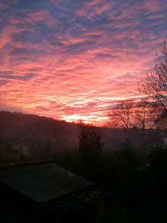
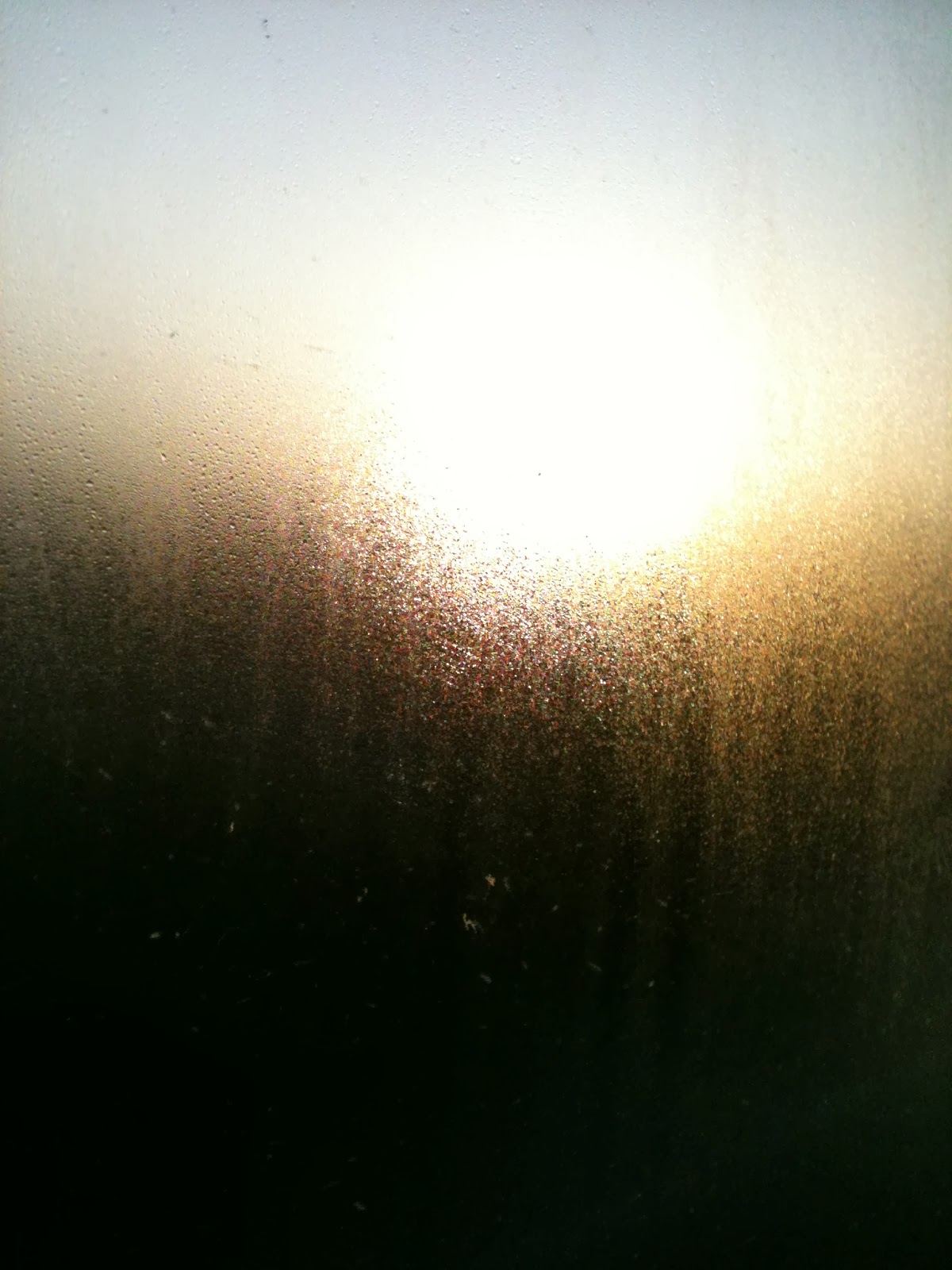
iPhone Sky Photos
Over the last couple of months, I have been using my phone to capture all the interesting, unusual and beautiful skies and sunsets we have been getting. Here are a few of the photographs, unedited, which I have taken, often from my bedroom window!






Wednesday, 20 November 2013
Photographers using shadows - Paul Strand, Russ and Reyn and Henri Cartier-Bresson

Paul Strand
I like how Paul Strand has used the shadows in this photograph because it makes what would otherwise be quite a bland image into something much more interesting with lots of different shapes and angles within it. The lack of colour emphasises these shapes and helps to show what beautiful patterns can naturally be made by blocking out sections of light. I also like how the areas of light and shadow make the image become quite abstract making it unclear what the object is so you focus on the shadows and patterns made.

Russ and Reyn
Russ and Reyn's photograph is a much more modern and quirky use of shadows. I think the simplicity of the composition is successful because it is the creative idea of using the shadow in this way which really makes the image effective in my opinion, so there's no need to complicate it with the composition too.

Henri Cartier-Bresson
This photograph by Henri Cartier-Bresson appeals to me because of the way he has used the shadows. The profile of the person on the chair gives the image a creepy feeling as it seems like someone unknown is watching the chair and waiting. Because you can't see their features it feels more anonymous, like they are hiding their identity. I also think the use of shadows in the background is successful because it just gives the image a few more interesting shapes to look at. Because they make the background slightly darker too, it makes the white chair in the sun stand out even more so it's obviously the main focus of the image.
Tuesday, 19 November 2013
Photogram Artists - Abelardo Morell, Ethan Jantzer and Adam Fuss


Abelardo Morell
I particularly like these photograms by Abelardo Morell because of the tones, lines and shapes created through using the glasses in the images. I think the patterns created through the glass give the images a very delicate feeling which represents the objects well. It gives you more of an idea of how the object looks and feels rather than just creating a silhouette from it. I also think the simple composition of having only the glass in the centre of the frame helps to make these so successful because it means all your focus is on the interesting effects from the light rather than getting distracted by a complicated composition too.

Ethan Jantzer
This photogram appeals to me because of the different strengths of the lines. The contrast between the sharp lines at the front and the softer edges from the dandelion behind gives this photogram more layers to it and makes it feel more three-dimensional and real to me. The different tones also help you to realise which pieces are in front of which with the stronger silhouettes being nearer the front. Often with photograms if two objects are overlapping you can't distinguish between the two because they just come out as one colour but the fact that you can tell where each piece is in this image makes it much more effective and interesting to look at.

Adam Fuss
I prefer Adam Fuss' more abstract photograms because I think he manages to create such interesting textures and shapes, it isn't necessary to know exactly what the object is as that may sometimes take away from the mystery of the shapes. I particularly like this piece because in one simple photogram, there are so many different sections that make the piece so exciting and unusual to look at. For example, the bottom left corner looks very smooth and peaceful, then it goes into quite a rough speckled section before transforming into the middle section which looks smoky and ghostly.
Subscribe to:
Posts (Atom)