Wednesday, 20 November 2013

Photographers using shadows - Paul Strand, Russ and Reyn and Henri Cartier-Bresson

Paul Strand, Porch Shadows, 1916
Paul Strand
 
I like how Paul Strand has used the shadows in this photograph because it makes what would otherwise be quite a bland image into something much more interesting with lots of different shapes and angles within it. The lack of colour emphasises these shapes and helps to show what beautiful patterns can naturally be made by blocking out sections of light. I also like how the areas of light and shadow make the image become quite abstract making it unclear what the object is so you focus on the shadows and patterns made.


RussandReyn Shadow Drama   Russ and Reyn
Russ and Reyn
 
Russ and Reyn's photograph is a much more modern and quirky use of shadows. I think the simplicity of the composition is successful because it is the creative idea of using the shadow in this way which really makes the image effective in my opinion, so there's no need to complicate it with the composition too.
 
 
Henri Cartier-Bresson
 
 This photograph by Henri Cartier-Bresson appeals to me because of the way he has used the shadows. The profile of the person on the chair gives the image a creepy feeling as it seems like someone unknown is watching the chair and waiting. Because you can't see their features it feels more anonymous, like they are hiding their identity. I also think the use of shadows in the background is successful because it just gives the image a few more interesting shapes to look at. Because they make the background slightly darker too, it makes the white chair in the sun stand out even more so it's obviously the main focus of the image.


Tuesday, 19 November 2013

Photogram Artists - Abelardo Morell, Ethan Jantzer and Adam Fuss

Abelardo Morell
 
I particularly like these photograms by Abelardo Morell because of the tones, lines and shapes created through using the glasses in the images. I think the patterns created through the glass give the images a very delicate feeling which represents the objects well. It gives you more of an idea of how the object looks and feels rather than just creating a silhouette from it. I also think the simple composition of having only the glass in the centre of the frame helps to make these so successful because it means all your focus is on the interesting effects from the light rather than getting distracted by a complicated composition too.


Dandelion silhouettes photogram by Ethan Jantzer
 Ethan Jantzer
 
This photogram appeals to me because of the different strengths of the lines. The contrast between the sharp lines at the front and the softer edges from the dandelion behind gives this photogram more layers to it and makes it feel more three-dimensional and real to me. The different tones also help you to realise which pieces are in front of which with the stronger silhouettes being nearer the front. Often with photograms if two objects are overlapping you can't distinguish between the two because they just come out as one colour but the fact that you can tell where each piece is in this image makes it much more effective and interesting to look at.
 
 
Adam Fuss
 
I prefer Adam Fuss' more abstract photograms because I think he manages to create such interesting textures and shapes, it isn't necessary to know exactly what the object is as that may sometimes take away from the mystery of the shapes. I particularly like this piece because in one simple photogram, there are so many different sections that make the piece so exciting and unusual to look at. For example, the bottom left corner looks very smooth and peaceful, then it goes into quite a rough speckled section before transforming into the middle section which looks smoky and ghostly.


Sunday, 3 November 2013

Experimental drawing - Jennifer West, Rebecca Horn and Elizabeth Hoak-Doering


 Jennifer West
 
Jennifer West creates these pieces by hand manipulating her film using a variety of methods such as dye, deodorant or skateboard wheels. I think it's a really interesting method of adding marks onto the images because she won't have much control and won't be able to replicate the same patterns again which makes each piece more original and unusual in my opinion. The vibrant, unnatural colours created are eye-catching and give the photos a more modern and futuristic feeling. It makes me think about how old photographs weather with age but with technology developments, in the future this is how they may look when they've been left alone for a long time. I also like the photos as a set in the big strip as I think they work well with the continuous manipulation running through them.

Rebecca Horn
 
'Pencil Mask' by Rebecca Horn was created in 1972. It is strapped around the face to 'transform the wearer's head into an instrument for drawing'. The pencils are approximately 2 inches long and Horn has described how she 'moves her body rhythmically from left to right infront of a white wall. The pencils make marks on the wall the image of which corresponds to the rhythm of the movements.’ This piece interests me as the actual mask itself is as much a piece of art as the drawings created from wearing it. I think it may be particularly successful in creating impressions of landscapes as the drawings themselves won't be very detailed yet I think you would still be able to create an effective impression of soft light areas such as the sky compared to maybe darker and denser areas such as woods possibly. However, Horn may have used the mask to create more personal pieces because as she said the marks correspond to her movements, she may have moved in a way which reflects her emotions or feelings to create a piece reflecting that rather than something which she can see.
Elizabeth Hoak-Doering
 
This drawing is from the series 'things, witnesses!' where Elizabeth hung objects such as an office chair, a bedframe, a kitchen table and a hat rack from the ceiling of a building. Motor sensors were attached so when people walked past, the object moved and created part of the drawing. This means that when the exhibition was initially set up, there was no drawing but as people came in and visited the pieces, the drawings gradually developed. I quite like the technical aspect of these drawings because even though you don't know how they will turn out because it depends on how many people walk past and when, they make interesting shapes and patterns on the paper. I also like the way that in the exhibition, although it's Elizabeth's work as it was her idea, she has no control over how the drawings will turn out. In some ways it makes them quite neutral as they are free from any pre-conceived ideas about what makes something look successful and appealing as it's all automatic.

Thursday, 31 October 2013

Artists who using walking within their work


Vito Accounci, Follow Piece, 1969
Vito Acconci
 
Vito Acconci's 'Following Piece' consisted of him following passers-by around NYC until they entered private property. This ranged from 2-3 minutes while they walked to their car and he didn't have chance to find a taxi to follow it, up to 7-8 hours where they went to watch a film or to a restaurant. This piece was created in 1969 so was one of the first pieces of performance art. It was the start of the change in art, in the late 60s, where artwork moved from being just pieces in galleries to outside, exploring real issues in the world - this is what makes this piece significant to me. Because I prefer looking at conceptual artwork which has an interesting meaning or story behind it, I think this piece is important as it helped start such a big area of what is considered art today by using a quite simple idea, it has had a big impact.
 
 
Stanley Brouwn
 
This piece - 'Steps of pedestrians on paper' - was created by Stanley Brouwn. He left blank pieces of paper on the streets of Amsterdam, waited for people to leave footprints on them before collecting them. I particularly like this piece because not only is it nice to look at with the subtle patterns from the soles of shoes and the unsymmetrical composition, but I think it's an interesting and unusual way of collecting information about who's been where. It reminds me of footprints in the sand however they are lost when the tide comes in but because these footprints have been recorded on paper, they can stay forever.
 
 
Teching Hseih, One Year Performance 1981
Tehching Hsieh
 
Tehching Hsieh conducted a one year performance piece where he lived for the entire year without entering any the interior of anything - building or vehicle. This meant he must always walk and live outside starting from September 26, 1981 at 2 pm until September 26, 1982 at 2 pm. He allowed himself a sleeping bag and that was all. This was one of a few one year projects he completed, all of which were equally extreme. I think he was making a point, similar to Vito Acconci, about how art can be more than just a painting. He was making people aware of different issues whilst still creating art.

Tuesday, 29 October 2013

Photos beginning with 'L'


After being given the letter 'L', I had 5 minutes to take 3 photographs, using my phone, of objects beginning with this letter. I particularly like the way the photograph of the light came out as it was just a plain white light yet when it is was photographed, some much more colourful elements appeared. The black background helps to keep it really simple too. I also think the composition of the photograph of the lead is successful because I like the way it leads you in from the top of the frame to where the photograph is in focus, near the bottom. Because I took the photograph from above the lead, it makes the perspective more interesting than if it was just taken flat on.


Wednesday, 16 October 2013

Photographers - Lewis Hine, Ansel Adams and William Klein

Lewis Hine

I particularly like this photograph by Lewis Hine because of the emotion shown through the boy's eyes. It is a really honest, genuine photo showing the feelings of just one of the many children who were working in the cotton mills. Having his eyes right in the centre of the frame means they are the first thing you notice and because he is looking directly into the camera, it feels as if he is looking right at you and explaining his life in one still shot. The connection you feel with this little boy who you know nothing about is what I think makes this photograph so significant.
 
Ansel Adams
The sense of the atmosphere is very successful in this image of Ansel Adams'. The mist covering the background with only the sunset visible creates a spooky and slightly dull feel which is exaggerated by the fact that no-one is around. The mist also makes the silhouette of the tree stronger as there is nothing to detract from it. Having the image in black and white helps make this photo more memorable and effective too because again it adds to the calm but eerie atmosphere which is what I like so much about the photograph.
 
William Klein
I especially like the composition in William Klein's photograph. It is unusual because the top of the child's head on the swing is chopped off and the other child in the bottom right corner is only just in the frame. I think this makes the photograph much more interesting to look at because it isn't how I'd expect a photograph to be composed yet it is still successful. I also like the way that because the child on the swing's eyes aren't in the photograph, you can't quite tell if they're enjoying it or not meaning the other child's face could then have various meanings too. This is a very natural snapshot of these children's lives and although we haven't got the exact story behind it, I like the way that everyone could take it in slightly different ways.


Fine Artists - Cornelia Parker, Annette Messager and Hew Locke

Cornelia Parker, ‘Thirty Pieces of Silver’ 1988-9Cornelia Parker, ‘Thirty Pieces of Silver’ 1988-9

Cornelia Parker
 
In this piece 'Thirty Pieces of Silver', Cornelia Parker has flattened silver objects such as plates, cutlery and candlesticks then arranged them into disc shaped compositions and hung them slightly off the ground. Cornelia flattened these objects in order to transform their meaning and worth. I think this is a particularly successful way to do this because to me, I know what the objects are but because they are no longer usable it changes how I look at them. I see the shapes that create them and what they're made of rather than just an average object. This makes me realise how they're worth more than I would initially expect because of the materials in them and how they're made. Having so many pieces displayed in the room like that makes me think about how many valuable things there are in the world. Although this piece makes it look like Cornelia has collected a lot in relation to the room, actually in relation to the world she has only collected a tiny fragment. This leads me to think about the amount of valuable items some people own and take for granted yet there are still so many people with nothing.
 
 
Annette MESSAGER | Pénétration [Penetration]
Annette Messager
 
Annette Messager has created stuffed fabric pieces in the shape of different body parts and displayed them by hanging them down. This whole piece seems to me very childish because of the soft pieces made like stuffed toys and the bright unrealistic colours often used on children's toys or in books but also because of the way she has separated out the pieces like she is trying to teach children the different body parts. Having the space between all the pieces makes me want to go into this room and explore all around the body parts looking at them from all the available angles and taking in the finer details. I also feel that going into that room would be exciting for a child because of all the pieces dangling so high above their heads and some coming down low so they could weave in and out of them and get lost in amongst these internal body parts. However, I do think that even though it is very bright and childish, Annette has tried to hide a more serious point about the body behind the initial excitement of seeing all the pieces.


Hew Locke
 
After creating an initial piece of art that the public didn't particularly understand or take the way that Hew Locke expected them to take it, I find it interesting that he then decided to respond to these comments by developing and changing the piece. I like the way he isn't afraid to completely re-work his piece to challenge the thoughts of the people viewing it. Looking at this piece alone, without having seen the previous pieces, I think it is immediately very intriguing. This is because it's obvious it's a package but the unusual shape and the way it's wrapped with string make it something different to a normal package. As you look more closely at it and see the sections of colour inside and the words cut into the package I think it becomes more clear that the piece is about foreign cultures and their traditions being sent over to us to buy and try to experience. I think the way Hew Locke has designed the piece is successful because the unnatural angles and way it's placed and set up make it inviting for me to go and look closely at it. The small glimpses you get of the colour inside are clever as they allow you to see enough to understand the piece yet it isn't glaringly obvious and remains fairly subtle.

Friday, 11 October 2013

Evaluation of introduction to 2D design


After having a 2 week introduction to 2D design, I am certainly more aware of 2D design in my everyday environment - from wall paper patterns to road signs, they all must be designed by a 2D designer of some sort. I think my ideas of what 2D design can involve has definitely broadened.

The one particular discipline I was most interested by was typography. This was because I found it really interesting looking at typography artists and how typography can be made in such a large variety of ways. Posters and pieces of art could be purely typography and still be just as successful if not more successful than pieces including images.


Isidro Ferrer
http://soleneleblanc.com/files/gimgs/13_nevers3_v2.jpg
Solene LeBlanc


These two artists above especially inspired me as they created their typography in such an unusual way. It really emphasised to me the fact that typography is so important and can be much more versatile than just digital ready made fonts.


'A Concrete Identity' Article from Creative Review August 2013

Whilst reading Creative Review, I found an article called 'A Concrete Identity' about the Barbican in London and how its identity has changed and developed over the years through working with various artists.

I found this article particularly interesting as it explained why certain design decisions were made and it shows the progression from how it looked in 1982 up until now. For example, the current font used in the Barbican logo is Futura. The designers were looking at geometric fonts, especially ones with single-storey 'a's and chose Futura because of the circular letterforms which naturally fitted with the building's architecture and half-roundel logo. This article also explains problems which were encountered such as the designers being worried the new font would cause too many comparisons with a previous museum also using Futura. This interested me as it highlighted the factors the designers must consider when re-creating a logo. It isn't enough for the logo to just look appealing, it must also not be too similar to any others to ensure it's original and not confused with other companies. The final part of the article describes the latest change to Barbican's identity which was to remove the name from the carrier and place it vertically. This change was made to allow the name to be much larger on the poster/promotional material however the headline would still be read first. This specifically made me realise how much thought is put into the placing of all text and logos on different venue's identity - everything is put somewhere for a reason and the more thought which is put into it will usually create the more successful results.


Friday, 4 October 2013

Timorous Beasties


Timorous Beasties work, often used for wallpaper or fabric covers, is usually a repeated pattern. These two examples are two of my favourites as I think the composition of the example on the left is particularly successful. The small white areas around each of the illustrations means there is a good balance between pink and white so the piece remains quite light but with sections of strong colour. I also like the colours in the piece on the right as I think the green is quite an unusual shade which is complimented by the white. Because there are just two main colours, it means it would be effective in the home because if there were too many colours, it would be harder to match with other furniture. In addition, I like the way from further away it looks like an abstract pattern and although you can tell it's a repeated pattern it doesn't look too regimented or harsh and when you come closer, you see all the details in the illustrations and different shades in the background.

Noma Bar


I find these pieces by Noma Bar particularly successful because of their simplicity but complexity at the same time. Using a few shapes he has managed to create an image which when looked at one way can portray one object but when looked at in a different way can also been seen as another. He has managed to make complex designs appear effortless, clean and crisp which I think has been achieved mainly through the colour palette. The limited colours he has used gives the shapes a bold outline which is also emphasised by the lack of detail. Personally, I find it exciting to look at his work and discover what different objects he has managed to combine together. It makes me want to spend more time looking at his work to see what is hidden inside each piece. Because it is so subtle, you must look at his work in a way you may not look at other artists' work, considering how the positive and negative shapes could be different objects. Overall, I think his work has been well thought out to engage the viewer into his pieces.

Sunday, 22 September 2013

Personal Response to Tony Cragg

I have chosen to look at the artist Tony Cragg, a sculptural artist from Liverpool. I particularly like his sculptures because of the shapes he uses. The main, basic shapes he uses are usually fairly simple but through repetition or the composition, I find the pieces look very successful. Rather than colour or pattern for example, Tony Cragg uses shape as the main focus of his pieces which is why the pieces are usually one plain colour. I think this works well because it means your attention isn't diverted onto something which isn't the main aspect of his artwork. I believe all Tony Cragg's sculptures to be skilfully well made as I think they all look very precise and have smooth edges and curves which are essential to make the shapes appear even more effortless.

Tony Cragg's Sculptures


The main piece of Tony Cragg's which I looked at was the sculpture pictured below called 'Red Square'. I found the way that this piece looks as if it's one piece of material which has been twisted around into different shapes really intriguing. It made me immediately want to experiment more with paper and find all the different shapes and forms I could make with it by twisting it around and through itself. The small gap all the way around the piece also interested me because it made me think about how we will never know what's on the inside of the piece. He has left a small gap for us to look through but there's not enough room for us to fully explore the inside of the piece and see if he's left anything hidden inside.
'Red Square' - Tony Cragg

Based on this piece I created my own response using paper. I tried to include the natural shapes and curves which Tony Cragg uses and not force the paper too much by folding or scrunching it as that way it would lose the natural beauty. I also chose to use plain paper as, much like Tony's work, this would lead to the focus being on the forms created. Finally, the main piece of inspiration I took from the 'Red Square' piece was the viewer not being able to know what was inside. I deliberately made the sides of my piece higher than the middle therefore from all side angles - except one which gives a brief glimpse of what's inside - the piece looks very plain. However, when viewed from above, you can see straight into all the layers beneath. It gives the viewers the chance to explore the whole piece of they are willing to investigate it and look from all angles.
View from front
View from back
View from top

There are many similarities between Barbara Hepworth and Tony Cragg's work as they both create natural, large, round sculptures. However, I think where Cragg's work may be slightly more detailed with the shapes being repeated or curving in and out and twisting around itself, Hepworth's work is generally plainer with one large shape. She also often likes to use large holes in her sculptures where Tony Cragg doesn't. Because her sculptures are larger and plainer, I think these holes are successful as they provide a break from the thick main piece and make it seem lighter. Because Tony Cragg's sculptures aren't made of such a bulk of material, I don't think the holes would be as successful in his work.
Barbara Hepworth


Saturday, 21 September 2013

Experimenting with wire, canvas, plastic and paper

Based on the theme of connections, I have tried experimenting with various different materials to create different ways of fastening or attaching two separate pieces together.

I found the paper and wire most enjoyable and successful but for different reasons. I enjoyed using the paper as I thought the natural, organic shapes it creates as the paper curves was very beautiful. To hold these shapes together I cut slots into the paper and tucked other parts inside - I found this a very neat and effective way to hold the shapes without the use of glue.


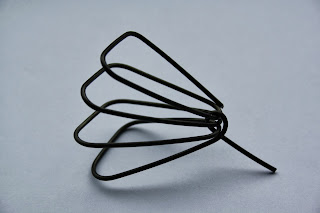
I also produced some successful results with the wire as I managed to find ways to connect and hold the pieces together which were really simple. Because they weren't too complex, it meant the sample looked well-made and professional. The piece pictured is my favourite as it is all made from one piece of wire and I think the loop to hold it together looks effective as a small part of added detail as well as working productively to keep the piece in place.


I found the canvas and plastic bin bags harder to work with and create samples which I thought were successful as the shapes they created weren't so smooth and natural and organic - like the paper and wire - which are the kinds of shapes I like best. However, by combining the canvas and wire together, I did manage to make a couple of pieces which I liked by using the wire to hold the canvas in certain positions. This worked well as it meant I was more able to keep the canvas more natural positions which without the wire, wouldn't have been possible.